Common interior design mistakes

Common interior design mistakes

There are a lot of common mistakes that people make when they are designing their interiors. I want to share with you 7 most common mistakes in interior design. I will provide you with tips and information and how to avoid it immediately. Of course, we all make mistakes. The important thing is to fix them!

Mistake #1. Designing the room without considering your style and needs.

One of the biggest mistake about designing space is that people don’t stop to think and to ask themselves what they really want and need. Instead of following trends and use someones ideas, first ask yourself what you admire about the rooms, what you like about those inspirations. Is it the colors? The textures? The materials? The lightning? The kind of furniture? Once you have personal preferences, then you can begin your own interior home decoration with confidence. Remember – the good design is not only about the beauty. You should live in your space and identify how family uses it before you remodel. Because it is a great way to learn about details you will want to include in your design plans.

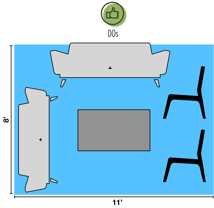
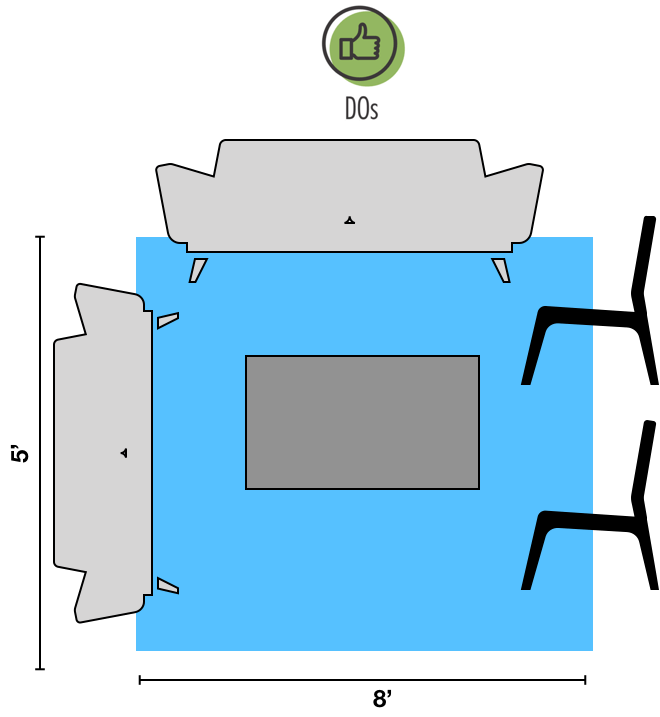
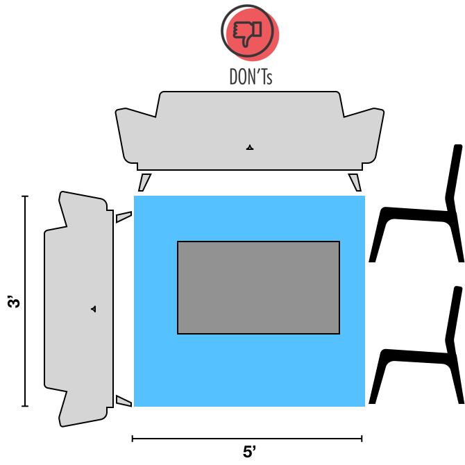
Mistake #2. Not measuring the space.

Before selecting furniture and decor elements you must measure your space. Not planning a space usage is a common interior design mistake that people make. Don’t rely on your eyes to measure space before purchasing furniture and decorative accents measure all the dimensions of your space to avoid over crowding or under furnituring. Think about the space for the circulation you need, measure the heights available, take elements of your wall to select an art in a scale and proportion of the area.

Mistake #3: Exposed cables.

All details count an interior design. Another common mistake that affects perception and order in a space – as having visible cables that run through walls and other surfaces. It is important to hide these cables and wires, especially near TV, lamps, and other electrical fixtures. If you can hide TV cables inside the walls, choose to use a cord hider, you will have better appearance instantly.

Hide wire clutter with plastic shower rod cover
How to hide your television cables? « Cherrie Hub

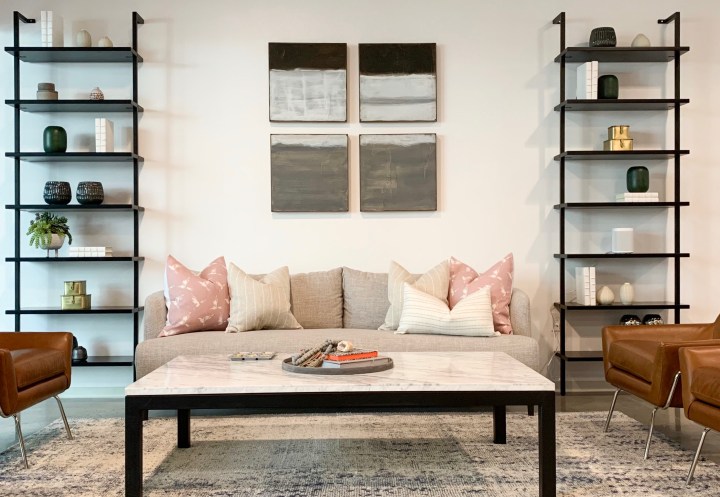
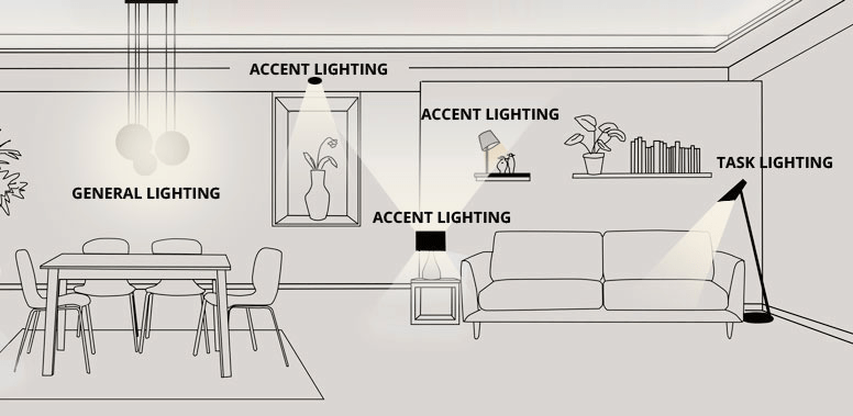
Mistake #4. Having one light source.

Lighting is a key in interior design and it is an aspect that people often forget. Having a single light source in each room may allow you to see in the dark, but it is not doing your decor any favors. Add layered lights. Only one light source is not enough because it doesn’t help to create contrast, depth or define shapes and make the colors pop. Fix this mistake by adding different lightning sources in the space. You need to have layered lightning sources such as ambient lightning for overall illumination through table, wall, hanging or ceiling lamps. Accent light to highlight and draw attention to specific object or area. Add task lightning to a particular task or activity such as reading, writing or eating. A good lightening plan for the interior decoration will combine all three sources at different heights.

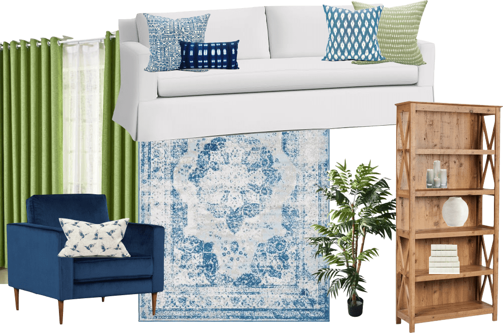
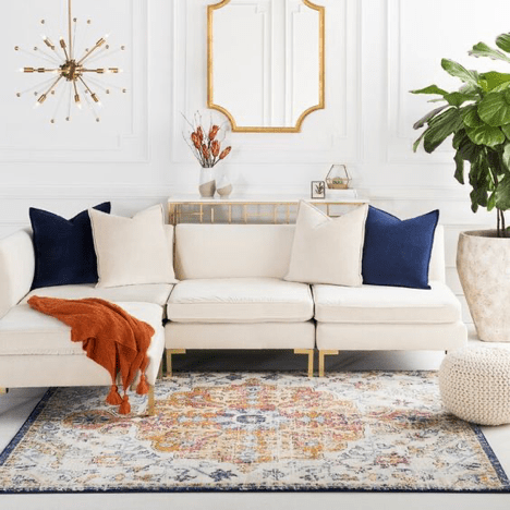
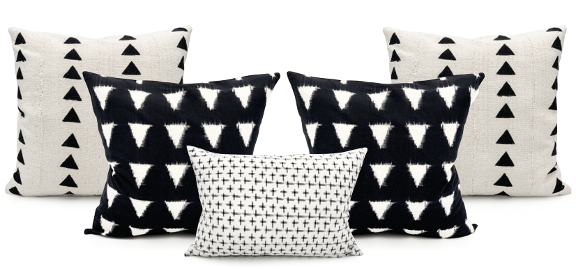
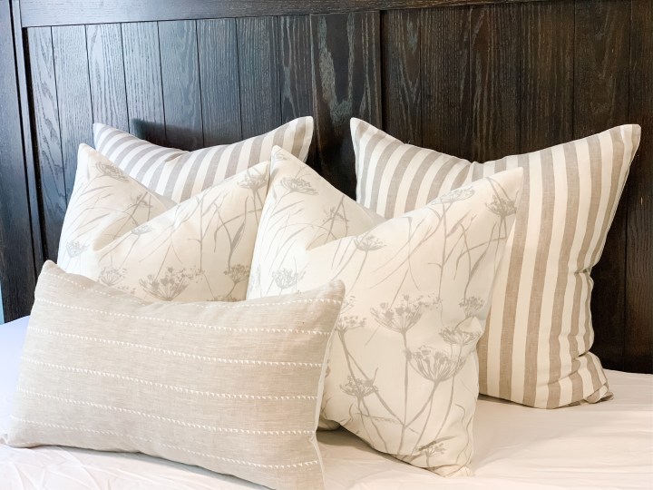
Mistake #5. Rug Size.

Since rugs are essential for creating boundaries for your furniture and defining spaces, you must ensure that your rug has appropriate size. You should use a correct size for your space. To find the right size rug, you must consider the size and the spacing of the furniture in the room. It is important to make sure that all the furniture fits on the rug. To at least the front legs of all of the sittings in the space.

Mistake # 6. Wrong Curtains Size and Height.

 Curtains or blinds can make or brake a home. What is the most common mistake people make when it comes to window treatment? Best way to decorate tall windows – with high curtains. Curtains make the room look more spacious when you mound the curtain rod closer to the ceiling instead of at the window frame. The floor landed curtains throw the eyes wide along the entire length of the curtains creating an illusions of height and spaciousness.

Do position of your rod approximately  4-6’’ above the window or install it closer to the ceiling

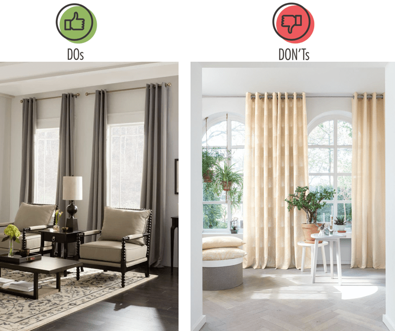
Ensure the rod is wide enough, so when the curtains are open, the inner edges just cover the windows frame but not the glass.  

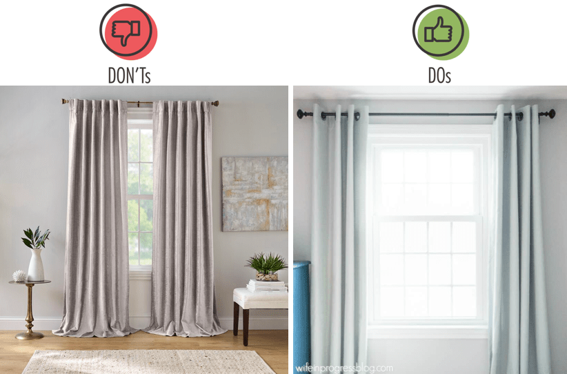
Stacking the curtain next to the window instead of covering it will help the window appear larger.

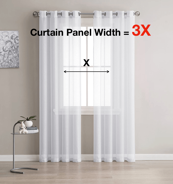
For an elegant look curtain’s panel’s should be wide enough that even when closed – there is fullness of them. To achieve that the width of the panels full and elegant, width of the curtain should be 3 times wider that the window.

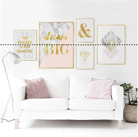
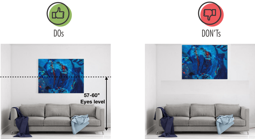
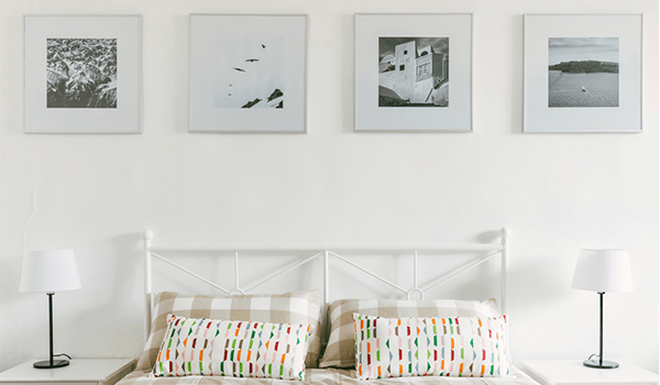
Mistake #7: Wrong placement of the art on the wall

Hanging art too high or too low is a very common mistake. People  tent to hang art closer to the ceiling than it should be. Art should be hang at about eye level to appreciate in a natural way the piece of art.

Align the pieces of art at their center.

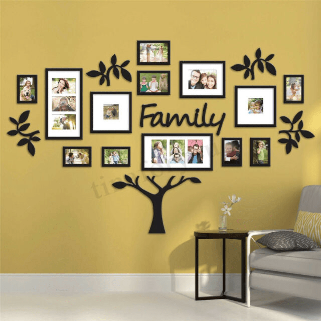
 If you have several pieces of art in the frames or pictures, you can organize a gallery wall where each piece will be identical frames, or you can mix sizes and orientations of the frames for more relaxed style.

The best way to ensure that there is no mistakes – is to cut a frame outline on paper. Simply tape the tape cutout on the wall trying numerous placement options until you have a desired outcome

I hope this information was helpful for you and you will consider it when you will be decorating your home.

Tips of how to combine colors in your room

Tips of how to combine colors in your room

Why colors are so important in our life? How the color affects our everyday lives? Why it is critical to create a perfect color scheme for our space? It is because color is a form of non verbal communication. Color helps us to store and process images in our memories, that can radically affect our mood and emotions. When you walk into any space, the way you can translate the color and color combinations, can impact how you interpret the style, your mood and overall comfort level of the space. Actually, we are constantly combining colors when we are selecting our outfit or when we are choosing new decorative pillows, rug or curtain for our living room. All the time we are mixing and matching colors and patterns. It is true that the right way of selecting matching colors benefits your everyday life.

One of the most frequent questions that we are getting from our customers is to help them with the pillow combinations for their rooms,  how to combine, mix and match different colors, designs, textures and patterns and style them together. 

I want to provide you some tips of how to incorporate color combinations into your space.

Color theory is about of how we interpret colors that we see, and how we respond to specific color combination and proportions. Color theory starts with the color wheel. 

There are three primary colors: red, blue and yellow. They are the building blocks of all other colors, they cannot be made by mixing other colors. Secondary colors – colors that can be made by mixing two primary colors. Secondary colors – orange, green and purple. Tertiary colors – the six shades that can be made by combining primary and secondary colors.

Now, let’s see how we can use colors when to create color scheme. 

Analogous colors

We can create an Analogous color scheme by choosing three or more colors that sitting next to each other in the color wheel.

Let me show you the example of the rooms that are decorated using analogous colors:

  1. Green and Blue:

2. Red and Orange.

3. Blue and Purple

Since you are using three colors for that spaces, proportion is very important to keep the balance. You can incorporate 60%-30%-10% rule to keep an appropriate proportion between colors.

60% – Rug, Accent Pieces, Sofas, Walls

30% – Curtains, Side Chairs or Accessories

10% – Pillows, Patterned Fabrics, Decorative Accessories, Artwork

It is important to note that some natural textures such as wood, green plants or metal accessories can create beautiful dimension to the space.

If you prefer to have neutral colors for the overall look of the space, then you can add a pop-up color into your room that will beautifully compliment the look. If that is the case, you can apply an analogous color scheme into your accent elements and accessories as well.

Complimentary COlors

Another way to use a color wheel – is to select complimentary colors.

When it comes to  the color scheme, complimentary is the simplest solution, because this color scheme only involves two shades that are opposite to each other in the color wheel. Typically, one color acts as a dominant shade, the other – as an accent. That colors are extremely in high contrast, so you need to be careful of how to use them because they bring a strong energy into the space and it is a good idea to use them in small doses. You should think of them as an accents, and you should use plenty of neutrals to balance them out and provide a place for the eye to rest.

  1. Purple and Yellow

2. Red and Green

3. Blue and Orange. You can add a pop of color to the neutral general space. Apply contrasting colors into your accent elements and accessories

Monochromatic Colors.

You can use tints, shades and tones of the same within the same color family

 Adding white to a pure color creates tints, adding black and white to a pure color creates tones of colors, adding black to color creates shades.

 Unity – is one of the benefits using monochromatic color scheme, but on  the other hand, this scheme is having a risk of making room boring. So, the best way to use this scheme is to combine different textures and prints. Add different patterns and textures to break up the monotony, it is also important to add natural textures or metals to add dimension to the room.

However, since interior design is not rigid , you can mix and match different color schemes in the same space. For example, you can have your walls, furniture, flooring and the general elements of the space on black , grey and white, which is a monochromatic option, and combine it with contrasting color scheme for accessories , like blue ottoman with orange cushions. Throws and other kinds of accessories 

Some important extra tips about adding colors into your space are:

  • Tie rooms together with accents. Accent colors can change from room to room, but continuing one consisting color through the home, help to connect the different spaces. Its purpose is to move the eyes around different rooms and to associate each one to another using the same color in some details, helping you balance and unify the spaces.
  • Use a consistent paint color on the walls – another simple way to create a cohesive feel. This is especially in homes that have open space concept
  • Add color prints and textures and shades into the space and pair it with solid colors, following the color scheme rules to get a perfect combination

If you want to learn more about colors, especially on how to select a perfect color for any space, how to combine, mix and match them depending on the style, or mood you want to create, follow our blog and visit our website krinto.com.

How to Master Throw Pillows on your sofa

How to Master Throw Pillows on your sofa

If you have noticed right now, we are a little obsessed with throw pillows. 

Today I am going to tell you how to master throw pillows on your sofa. I will talk about selection of right size of the pillows, how to properly place them together, how to mix and match colors and textures, and some common mistakes people make when they styling sofas.

Selecting a right size

The first thing you need to do is to select a right size of your pillow. Going too big will dwarf your sofa. Selecting too small pillows will not make your sofa look stunning, and I just don’t like the way they look. I recommend for the pillows to be a little bit on a bigger size. So, for standard size sofa it is preferably use 22×22’ or 24×24’ pillows on each corner at the back. 

With the larger pillows, it is the same principle as I described in my previous blog of “How to style your bed”. Larger pillows, I call them “staples”, ground the look and tie the pillow vignette together. “Staples” are more universal for different styles, occasions, and seasons pillows. Large “Staples” are used for everyday decoration and their covers should be your investment pieces. If you are going to spend a bit more on a style you LOVE, let it be here. Again, “Staple” pillows can be neutral, versatile and can be kept all year round.

We have beautiful collection of neutral linen pillow covers, which will work very well as “Staples” for your sofa or sectional.

So, you obviously want to start decorating your sofa with the biggest pillow at the back of each corner and then you place other smaller pillows forward. We recommend 22×22 and 20×20 or lumbar 14×20 or 16×24 on front.

Inserts:

I really encourage our customers to use high quality inserts. Most of our pillows inserts are from the US, the brand name is ComfyDown . You can find almost every size you need, they are 95% feather and 5% Down. We also find a great quality down inserts in IKEA’s FJADRAR.

Sizes:

For the pillows cover 24×24 use 26×26 down insert

For the pillow cover 20×20 use 20×20 down insert

For the pillows cover 16×24 use 16×26 down insert for more fuller look.

V shape” or not “V-Shape”?

It is totally up to you! I personally love my pillows having deep V down in the middle (“karate chop”), I think it is super cozy and inviting. But it is totally up to your personal preference. The most important is to use high quality covers and down inserts.

How to place pillows together?

The golden rule is to place large pillows at the back of the corners and add smaller pillows to the front. It is important to use different sizes to create more depth and cohesive look. 

When we are creating pillow combinations, we using the “rule of three”, which will create a more pleasant and complete vignette. What is the “rule of three”? The “rule of three” means that you are literally creating  triangles using various sizes of the pillows.

Here is some examples of our pillow combinations:

How to mix and match colors and textures?

And now it is time to start talking about pattern mixing and textures. I will be covering this topic in more details in my next blog posts.

There is no rule or real formula of how to mix and match your pillow covers, but I want to say that you always want to mix them the way so they compliment each other, but not compete with each other. 

I like to have mix of prints, woven or embroidered textiles together. For example organic print mixed with more straight lines graphic printed or woven. Those look great together with a solid texture at some dimension. Mixing different textiles such as linens, cotton, handwoven mudcloth, velvet, faux leather or vintage grain sack is also a trick. 

In a more traditional setting you will match your pillows at both sides of your sofa, but I tent to match all different prints and mix sizes. For example you have big print on a large pillow and a small scale print on a smaller pillow.

For the dark sofa you will start with the light pillow, so it breaks things up, and add smaller pillows that compliment or contrasting with the large pillow

If you have a light sofa, you will start with the dark, bright or contrasting pillow at the back.

Some common mistakes when you styling your sofa:

One of the most common mistake is selecting wrong size of the pillows. As I described earlier, the sofa will have more pleasant view when you choose bigger sizes of the pillows rather than if the pillows are way too small.

The other mistake – using pillows with the same sizes. It is better to vary the sizes of the pillows and create combinations.

Another mistake – is to placing pillows all over the sofa, not placing them in the corners and creating cozy combos.

To wrap it all up, you want to start with the size of your pillows. We like to start with the 24×24 and then move to 22×22, and then do a little lumbar or a tiny pillow at front. Pay attention to shapes and colors of your pillows and your sofa. Make sure that they are contrasting and complimenting each other. Choose some organic, some straight lines, and always textures. Choose different sizes for your pillows. That is how you going to style your sofa and make it look amazing.

Why vintage grain sack pillow so special?

Why vintage grain sack pillow so special?

Grainsacks fabrics became very popular these days for home decor. You can meet grain sack fabrics in pillows, upholstery, table runners, stairs runners, storage baskets or other elements of decor. Grain sack fabric is a vintage fabric, it was handmade in Europe over 100 years ago in late 1800’s to early 1900’s. The fabric is made from hemp and linen fibers and decorated with red, blue, green, caramel, black or indigo stripes. This fabric comes in rolls that is approximately 20 inches wide and people was stitched by hand. Some families personalized their grain sacks with the embroidered initials so their sacks were easily identified.

Antique grain sack is a popular design trend that is used in many decor styles:

  • •Cottage
  • •Boho
  • •French Country
  • •Farmhouse
  • •Shabby Chick

Where to find real antique vintage grain sack fabric?

Vintage grain sacks are available in limited supplies. European  distributors searching antique grain sacks all over eastern Europe. Since grain sacks are limited, they are not produced nowadays and can be called “one-of-a-kind”, they are pricey and in a high demand. When we started looking for this fabric, we knew this could be a challenge. If you are lucky, you can hunt for the antique grain sacks in the antique malls and shops, you can also found them at large antique shows and markets. If you traveling to Europe, you can find then in the flea markets of Sweden, Austria, France or Poland. We sourcing our grain sacks from Europe, carefully handpicking the best grain sacks, deconstruct them and make from them our pillows in house. We love red, blue, black and caramel striped grain sacks.Their natural textures and colors perfectly pair with unbleached cotton canvas to create luxury accent pillows for your house. We recommend more neutrally colored striped pillows, such as black, blue,  or caramel-brown, as a daily decor for your living room and bedroom. Red and greed stripped pillows add a stunning view of your house for some occasions such as Christmas, New Year, Valentines day, or St Patrias day. They can also be a perfect gift for the housewarming party or wedding.We welcome you to visit our vintage grain sack collection in our shop.

Tips for styling your bed.

Tips for styling your bed.

Are you bored with your bed? Do you want to change the look of your bedroom and style it? We all can admit that it is something very satisfying about perfectly put together bed, even though it takes a bit of effort. Only spending extra couple of minutes in the morning making your bed organized can elevate your mood and productivity throughout the whole day. Today we want to step further with the details, textures and colors, we want to share with you about how you can flawlessly style your bed with the perfectly placed pillow combinations, and skillfully folded throws. Here is some basic ideas for you to make the bed of your dreams:

Start with the high quality base

We all have different needs, but we all love comfort while we are in bed. As a general rule, purchase the best quality mattress as you can afford. It is worth the investment, as we all know, we spend a third of our life in bed.

For the sheets – we usually choose white color sheets made from natural textiles such as cotton, silk or linen. It is timeless classic, provides a lot of comfort and also it will perfectly match with any color of the pillows and throws and any style of your bedroom.

Place the top sheet

For more comfortable sleep and for completing arrangement of your bed – put the top sheet. Make sure to place the finished side of the top sheet on top of the duvet. Make an envelop by folding its corners underneath the mattress. We also recommend to choose white top sheet made from natural textiles.

Choosing the duvet

Depending on the season, occasion or simply your mood, select the most comfortable and cozy duvet. It could have single color, neutral white or bright color which is perfectly contrasting with the rest of the bed and complementing other decor elements of your bedroom such as curtains or rug. Your duvet could be made from natural textiles, contain  neutral textures, floral  or abstract patterns. A quick bed making trick: to show off all your pillows and layers fold your duvet in half and then pull the top part back into thirds.

Selecting the throw

Stylish throw complements the look of the bedroom and adding the finished touch to your bed. Place folded throw at the foot of your bed. Select gorgeous texture for your throw, for example natural wool throw that is chunky and hand knitted or handwoven such as these:

  1. Colossal Handknit Throw from Pottery Barn. Classic, timeless, neutral color and pattern, that perfectly match with linen stripe or printed pillows. 

2. Chunky Giant Handknit blanket. You can find a lot of options on Etsy. This very cozy and soft blanket beautiful for decorating  you bed as well as it is practical in use.

3. Handwoven Moroccan style throw. Beautiful texture, accent tassels and neutral geometric pattern or stripes – you never can go wrong with it. It is also very classy and versatile for many decor styles. There are a lot of different places where you can find moroccan throws that you like. This particular is from Anthropologie.

4. African Mudcloth or indigo mudcloth throws. They are just gorgeous! One of a kind, handmade by African artisans, mudcloth become so popular for room decoration. They also compliment the whole room if you style it with our mudcloth pillows.

We love these kinds of throws because they are handmade, authentic, very unique and definitely can add a character into your bedroom.

Select Pillow Combo

The most frequent question we get from our customers is to help them with the pillow combinations for their rooms. It is exciting to mix and match different patterns, colors, designs, sizes and style them together. 

There are several types of pillows when you are styling your bed. 

  • Large pillows, or “staples”. They are grounds the look and ties the pillow vignette together. Those pillows are everyday staples, they are more universal for many styles and occasions. “Staple” covers should then be your investment pieces. If you are going to spend a bit more on a style you LOVE, let it be here. These pillows can be neutral, versatile and can be kept out year round. We recommend to choose 24×24 covers that not only lie in the color of the bedroom, but also timeless classics that you won’t have to switch out often. For a modern or farmhouse look we created a collection of all favorite versatile, neutral staples. These pillow covers not only flow with our entire collection, but pair together beautifully as well. We recommend our striped linen covers – Megan, Karina, Kristina, Logan Merlin, Camilla, Valentina. The French linen plaid cover is also a great choice.  Make sure you are using a 26×26 insert with your 24×24 covers.
  • Add two or three 20×20 or 22×22, and one long pillow 16×24 or 14×42 in front of the large pillows for the fuller look. These 22×22,  20×20 or 16×24 pillows calls “seasonal”. As the seasons flow through the year, switch out your smaller pillows (not your entire collection). These seasonal covers might be more “trendy” pieces. As your collection go pillows grows, you can add in more. We created a big collection of “seasonal” pillow covers that you can find in our Prints and Basics , “African Mudcloth” or “Vintage Grainsack” sections of our on-line store. 

Here is several examples of the bedroom combinations that we have:


  • Long lumbar 14×42 pillow is called Bolster pillow. We have an exclusive collection of extra long bolster pillows so you can pick the style which is the best to compliment your bedding. They made from 100% cotton ikat and accented with four subtle corner tassels, which make the pillow to be a perfect finishing touch. These pillows providing extra support while reading at bed, relaxing or sleeping.

Here is the examples of the bedroom combinations that we have:

Bed pillow covers can have different textures and be slightly more soft compare to decorative pillow covers that are used for sofa decoration. We recommend using natural linen and cotton textiles.

Add finishing touch

What final touches can put together the entire bed? Put some energy into organizing and styling your nightstands. Add some flowers, lamp, books, frame your favorite picture. Even a small accessories can help create stylish and beautiful bed! 

We welcome you to visit our shop here.