Why colors are so important in our life? How the color affects our everyday lives? Why it is critical to create a perfect color scheme for our space? It is because color is a form of non verbal communication. Color helps us to store and process images in our memories, that can radically affect our mood and emotions. When you walk into any space, the way you can translate the color and color combinations, can impact how you interpret the style, your mood and overall comfort level of the space. Actually, we are constantly combining colors when we are selecting our outfit or when we are choosing new decorative pillows, rug or curtain for our living room. All the time we are mixing and matching colors and patterns. It is true that the right way of selecting matching colors benefits your everyday life.
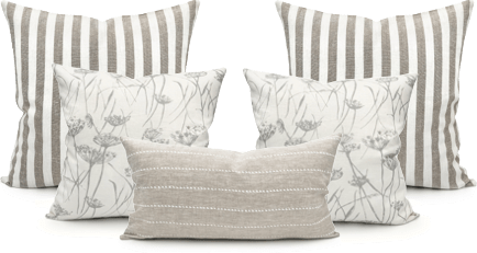
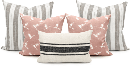
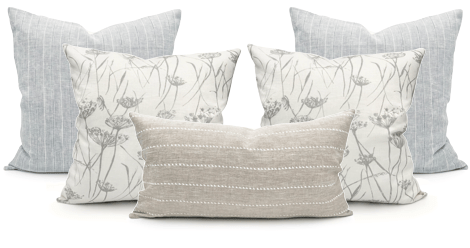
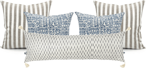
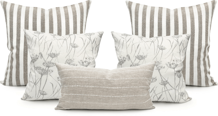
One of the most frequent questions that we are getting from our customers is to help them with the pillow combinations for their rooms, how to combine, mix and match different colors, designs, textures and patterns and style them together.
I want to provide you some tips of how to incorporate color combinations into your space.
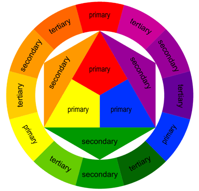
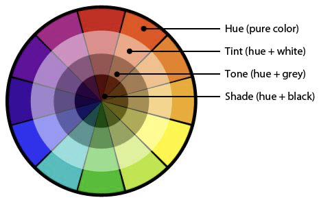
Color theory is about of how we interpret colors that we see, and how we respond to specific color combination and proportions. Color theory starts with the color wheel.
There are three primary colors: red, blue and yellow. They are the building blocks of all other colors, they cannot be made by mixing other colors. Secondary colors – colors that can be made by mixing two primary colors. Secondary colors – orange, green and purple. Tertiary colors – the six shades that can be made by combining primary and secondary colors.
Now, let’s see how we can use colors when to create color scheme.
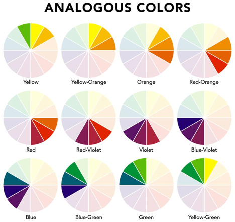
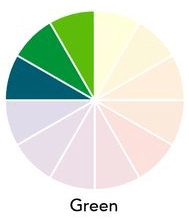
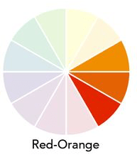
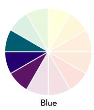
Analogous colors
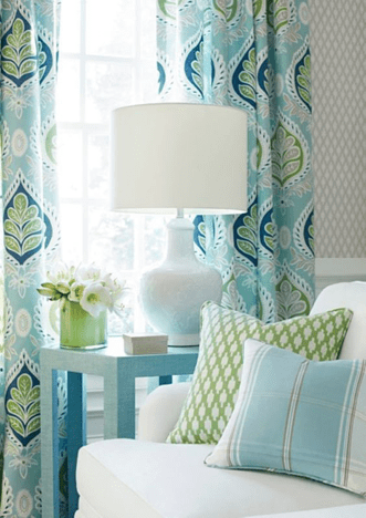
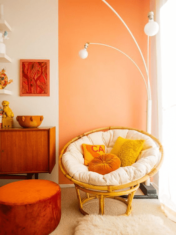
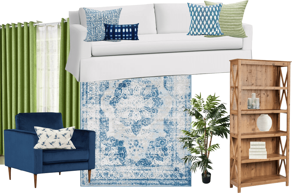
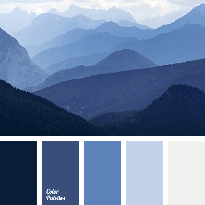
We can create an Analogous color scheme by choosing three or more colors that sitting next to each other in the color wheel.
Let me show you the example of the rooms that are decorated using analogous colors:
- Green and Blue:
2. Red and Orange.
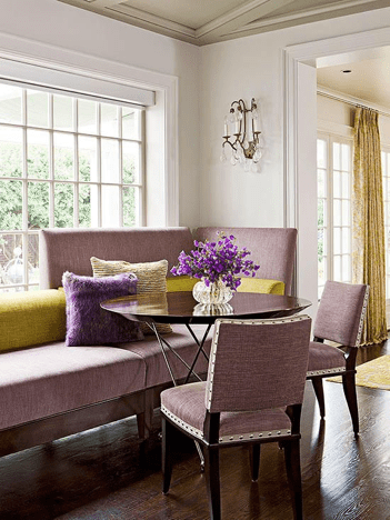
3. Blue and Purple
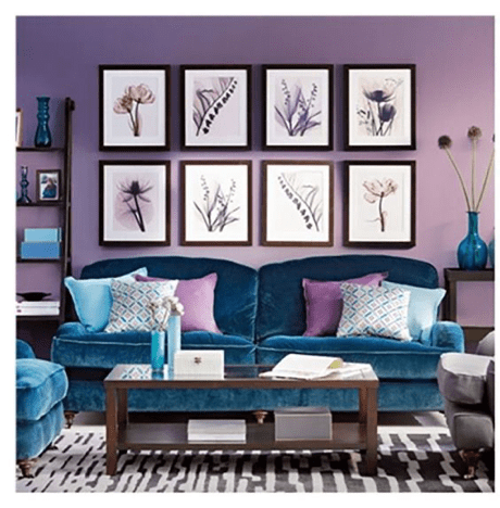
Since you are using three colors for that spaces, proportion is very important to keep the balance. You can incorporate 60%-30%-10% rule to keep an appropriate proportion between colors.
60% – Rug, Accent Pieces, Sofas, Walls
30% – Curtains, Side Chairs or Accessories
10% – Pillows, Patterned Fabrics, Decorative Accessories, Artwork
It is important to note that some natural textures such as wood, green plants or metal accessories can create beautiful dimension to the space.
If you prefer to have neutral colors for the overall look of the space, then you can add a pop-up color into your room that will beautifully compliment the look. If that is the case, you can apply an analogous color scheme into your accent elements and accessories as well.
Complimentary COlors
Another way to use a color wheel – is to select complimentary colors.
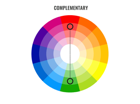
When it comes to the color scheme, complimentary is the simplest solution, because this color scheme only involves two shades that are opposite to each other in the color wheel. Typically, one color acts as a dominant shade, the other – as an accent. That colors are extremely in high contrast, so you need to be careful of how to use them because they bring a strong energy into the space and it is a good idea to use them in small doses. You should think of them as an accents, and you should use plenty of neutrals to balance them out and provide a place for the eye to rest.
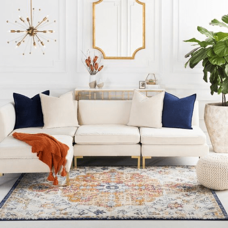
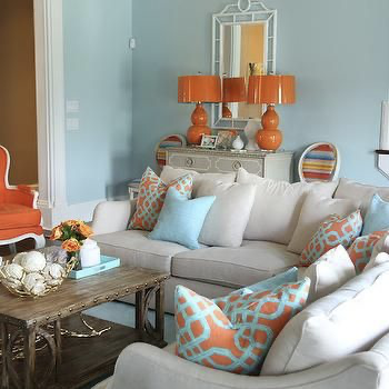
- Purple and Yellow

2. Red and Green

3. Blue and Orange. You can add a pop of color to the neutral general space. Apply contrasting colors into your accent elements and accessories

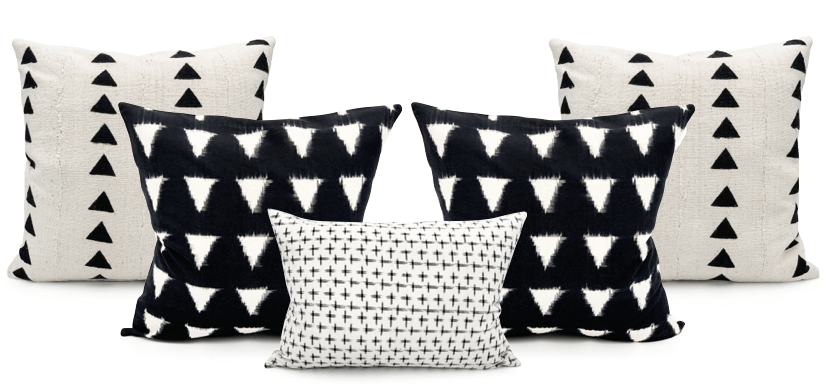
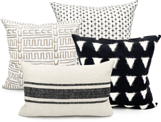
Monochromatic Colors.
You can use tints, shades and tones of the same within the same color family
Adding white to a pure color creates tints, adding black and white to a pure color creates tones of colors, adding black to color creates shades.
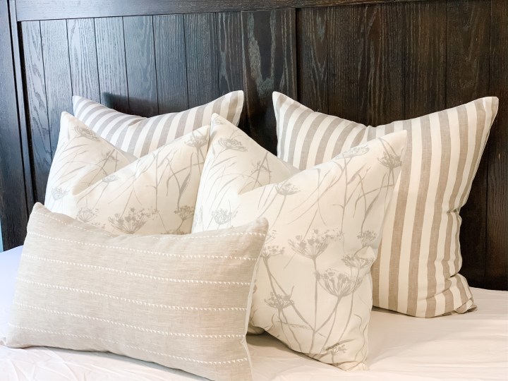
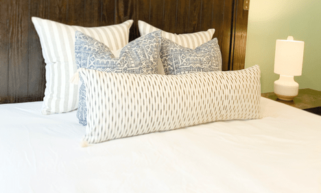
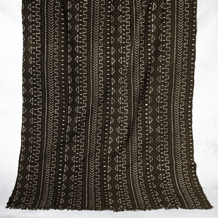
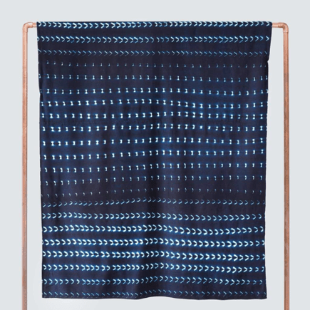
Unity – is one of the benefits using monochromatic color scheme, but on the other hand, this scheme is having a risk of making room boring. So, the best way to use this scheme is to combine different textures and prints. Add different patterns and textures to break up the monotony, it is also important to add natural textures or metals to add dimension to the room.
However, since interior design is not rigid , you can mix and match different color schemes in the same space. For example, you can have your walls, furniture, flooring and the general elements of the space on black , grey and white, which is a monochromatic option, and combine it with contrasting color scheme for accessories , like blue ottoman with orange cushions. Throws and other kinds of accessories
Some important extra tips about adding colors into your space are:
- Tie rooms together with accents. Accent colors can change from room to room, but continuing one consisting color through the home, help to connect the different spaces. Its purpose is to move the eyes around different rooms and to associate each one to another using the same color in some details, helping you balance and unify the spaces.
- Use a consistent paint color on the walls – another simple way to create a cohesive feel. This is especially in homes that have open space concept
- Add color prints and textures and shades into the space and pair it with solid colors, following the color scheme rules to get a perfect combination
If you want to learn more about colors, especially on how to select a perfect color for any space, how to combine, mix and match them depending on the style, or mood you want to create, follow our blog and visit our website krinto.com.